Different iPhone Text Input Implementations
September 7th, 2010 · 4 min read
While brainstorming ideas for my next iOS app, I come across the need to accept large text input on the iPhone. Given the small size of the screen, it’s hard to fit a whole lot of UI controls while keeping the simplicity of the app. In this post, I visit different implementations of iPhone text inputs found in some of my frequently-used apps.
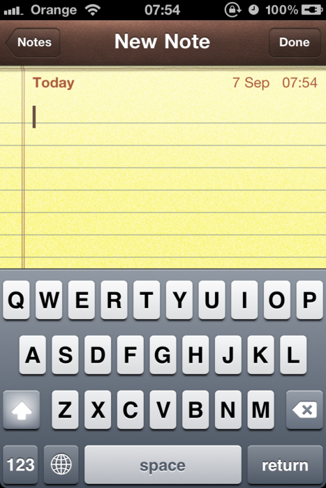
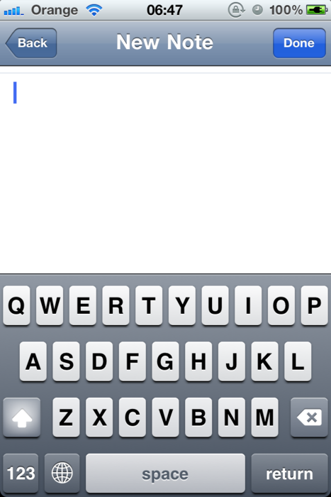
Let’s get started with something really simple. Like, the built-in Notes app with a basic text view set in Marker Felt.
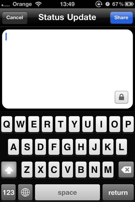
The official Facebook app uses the same full-scale text view for basic status update. Tapping on the Lock icon at the bottom right corner reveals the permission setings for the post.
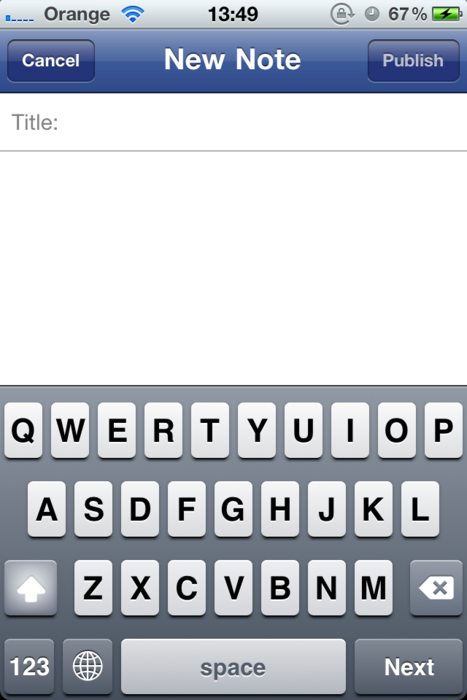
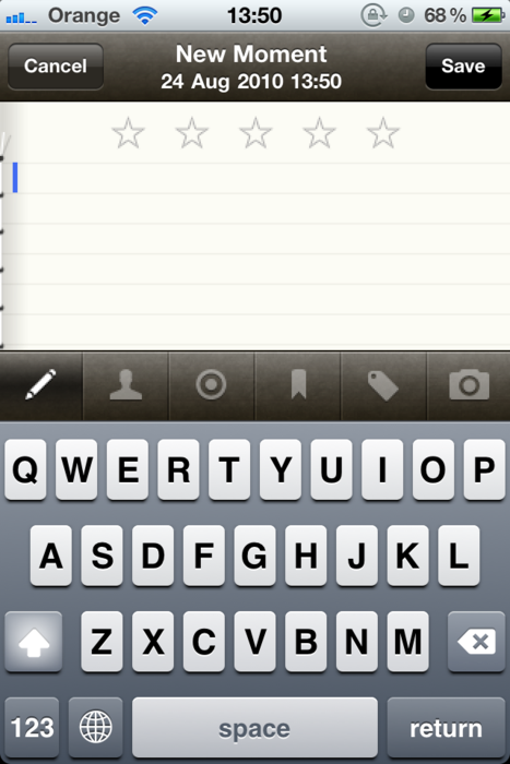
Creating Notes requires both the post body and a title, hence the screen is divided up into 2 different areas, with a thin line to separate them. Notice there’s no “Post body” placeholder in the text view.
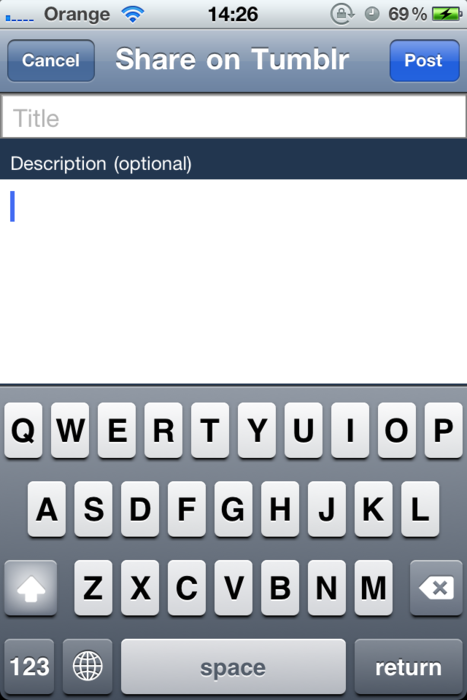
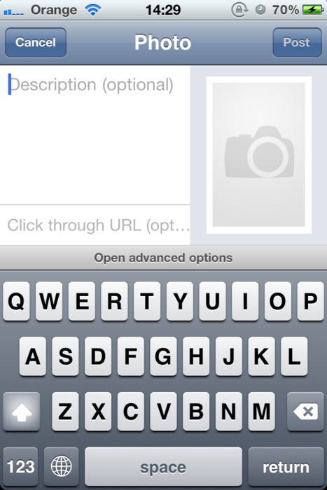
By contrast, Instapaper explicitly devotes some pixels to display the “Description (optional)” text on its Sharing screen. The rationale behind this, I think, is that the description text is meant to be pre-populated from the selected text in the current article; therefore, a placeholder might not be displayed to instruct the user of what to enter in the text input.
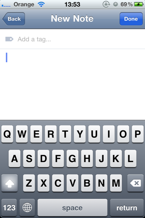
What if the optional field is only meant for advanced users? In case of Simplenote, the tag input is hidden by default and the user has to explicitly look for it by sliding down the text input. That way casual users with only a handful of notes don’t need to waste their precious screen space for something they don’t use. The existence of this feature is only hinted by a thin line near the top of the text input, which may prove to be unintuitive for many.
Now let’s take that up one notch: For many apps, a single extra button/text input just doesn’t cut it. Apps like Icebird (Twitter client), Reeder (Google Reader client), Momento (diary writing app) and Trunk Notes (personal wiki utility) display a toolbar right above the keyboard to give access to all their goodies. Their use is straight-forward and doesn’t require much explanation.
A horizontal toolbar isn’t the only solution. If needed, the screen can be divided vertically as well. The official Tumblr app, formerly known as Tumblrette, provides an example of this.
Slicing up the UI like this has its obvious disadvantage. The text input size is strictly limited and makes it more suitable for writing a short post rather than a full-length blog entry.
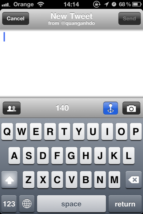
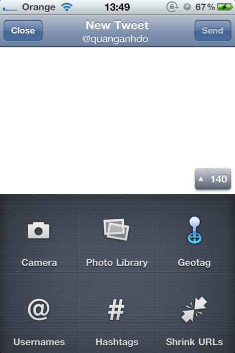
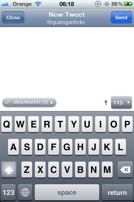
The official Twitter app, formerly called Tweetie, offers an interesting way to access its advanced functionalities. Tapping the small button at the bottom right corner of the text input slides down the software keyboard and gives way to geotagging, image uploading, URL shrinking, etc. Or, leave alone, and you will have a nice character count. Other UI controls (e.g. geotagging status, attachment list) will only appear next to that button when appropriate.
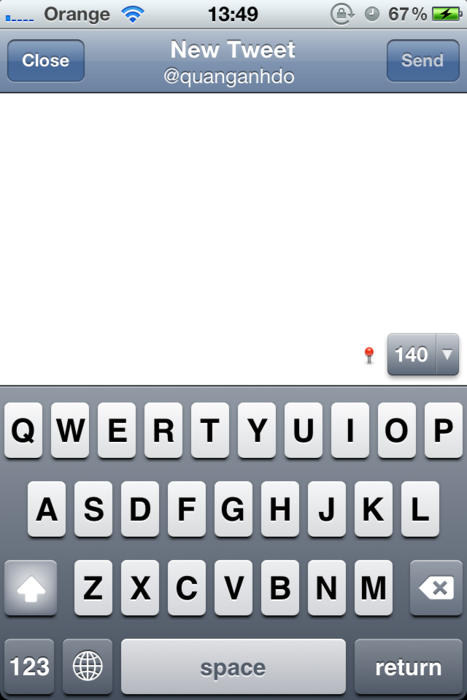
Note that the user can also tap the title bar to select the Twitter account from which he wants the tweet to be posted. In case he is replying to someone’s tweet, he can slide down the text input to read this particular tweet. The only complaint is that it might be hard to find out about those offering. I had been using the app daily for months without ever knowing about the latter feature, and would have continued like that if I haven’t came across one particular tweet sharing this tip.
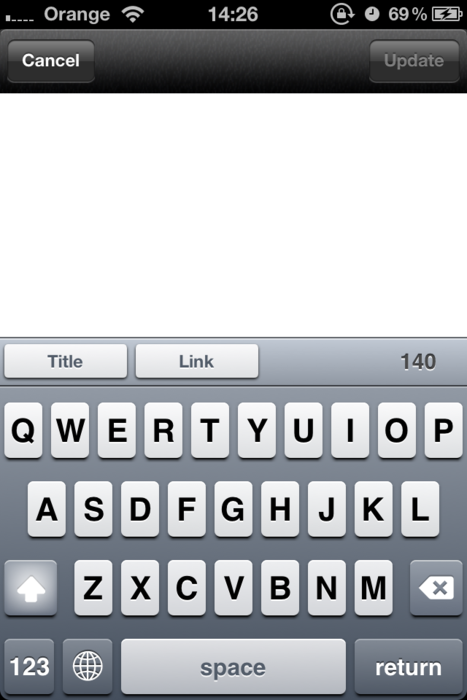
Unlike mentioned examples, sometimes the developers need to customise not the text input area, but the keyboard one. Soulver uses its toolbar to deliver different choices of the keyboard:
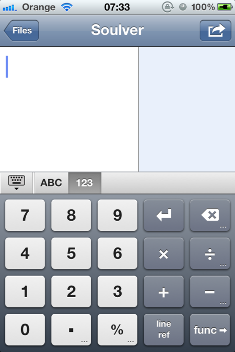
As a bonus, the user can use the first button to hide/show the software keyboard at will. Nice touch.
On the other hand, Wolfram offers a way to extend the keyboard, and page through different character maps. As powerful and convenient as it might be, the result is rather horrendous.
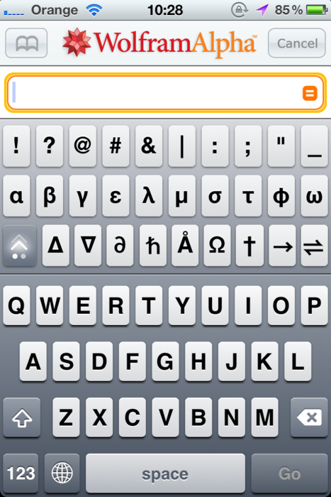
That’s an extreme example.
Complexity and flexibility don’t always mean messy screen and TaskPaper proves that. Simply adding or removing a space can change the nature of a particular line from a task to a sub-task, and the ways you can manipulate them (double tap to edit, swipe from right to left to cut/copy/paste/delete, swipe from left to right to mark/unmark as done, hold down and drag to move it to another place, etc) are amazing given the fact that what you see all the time is just a screenful of text.
If you’ve got any inspirational UI implementations that I haven’t mentioned, or just something to contribute, feel free to let me know.